Choosing the appropriate modern logo design is an essential first step for small business owners. It marks the change from a paper concept to a fully operational business!
You may naturally experience a great deal of pressure to design the ideal logo. We can help you relax and walk you through some of the various logo types to think about, such as:
1. Mascot Logos.
2. Combination mark logos.
3. Wordmark Logos.
4. Lettermark Logos.
5. Pictorial Logos.
6. Abstract Logos.
7. Emblem Logos.
8. Dynamic Logos.
9. 3D Logos.
While a logo is only one component of a wider branding image, knowing what you want before embarking on the design process helps guarantee you’re designing something that benefits you, your business, and your target audience.
9 Types Of Modern Logo Designs By ITG
Let’s discuss the nine different types of modern logo designs and their appropriate usage. Examples will be discussed to assist you in selecting the best kind for your brand identity.
Mascot Logos
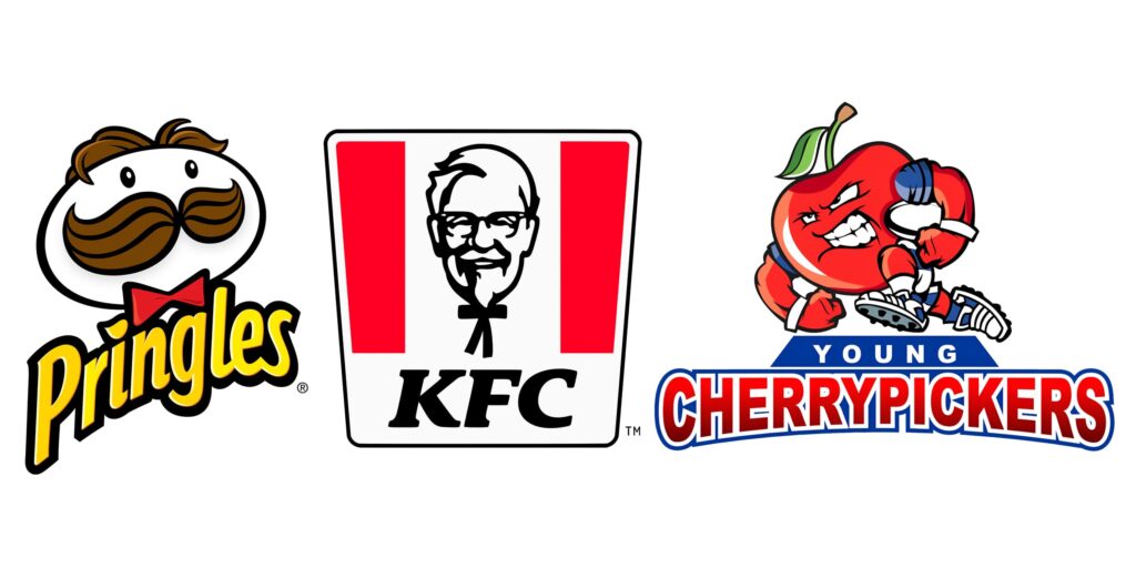
Mascot logos use a cartoon figure that represents a company. These logos provide people with a persona to identify with and relate to; they are frequently lighthearted and amiable.
Mascot logos are frequently employed by children’s brands because of their engaging qualities. Consider Kellog’s cast of characters, which includes Tucan Sam and Tony the Tiger.
These logotypes are excellent for usage by food brands, sports teams, and service providers.
Who Should Use Mascot Logos?
If you want to give your business some life and personality, go with a mascot logo. Mascots are excellent storytellers and animators.
Think about this:
- For a more friendly and empathic company image, think of using a mascot. A brand may appear more approachable and human by using mascots.
- Have a strong brand identity by using a mascot. Mascots may represent your brand’s characteristics and ideals.
- Use a mascot if your marketing incorporates storytelling or character-based storylines. Mascots are capable of taking on the lead role.
- In a competitive market, go with a mascot logo. A mascot may increase the distinctiveness and recognizableness of your business.
- To project a professional image, stay away from mascot logos. Mascots are occasionally seen as less serious or polished.
Combination Mark Logos
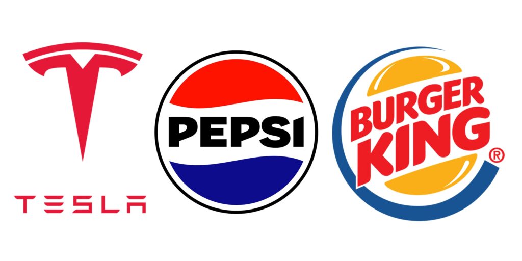
Combination mark logos allow a sign to be positioned within, outside, above, or below the text. At times, it may even stand in for a letter in the name of the firm.
Combination mark logos are also favorable if you want to go with a pictorial logo in the future. The more you publicize your logo, the more it will be recognized everywhere. You can see Nike with a symbol logo now, or Addidas, as it can be recognized in both ways.
Who Should Use Combination Mark Logos?
Companies that have developed strong brand identification through a combined logo design will ultimately seek to simplify their logo.
Consider these suggestions:
- A better option for increasing brand recognition is a combination logo.
- A versatile logo that works well on several media is a combination mark.
- Text and images work better to convey your brand’s beliefs and services.
- Because the visual components help set your brand apart, a combination logo works well for generic brand names.
Wordmark Logos
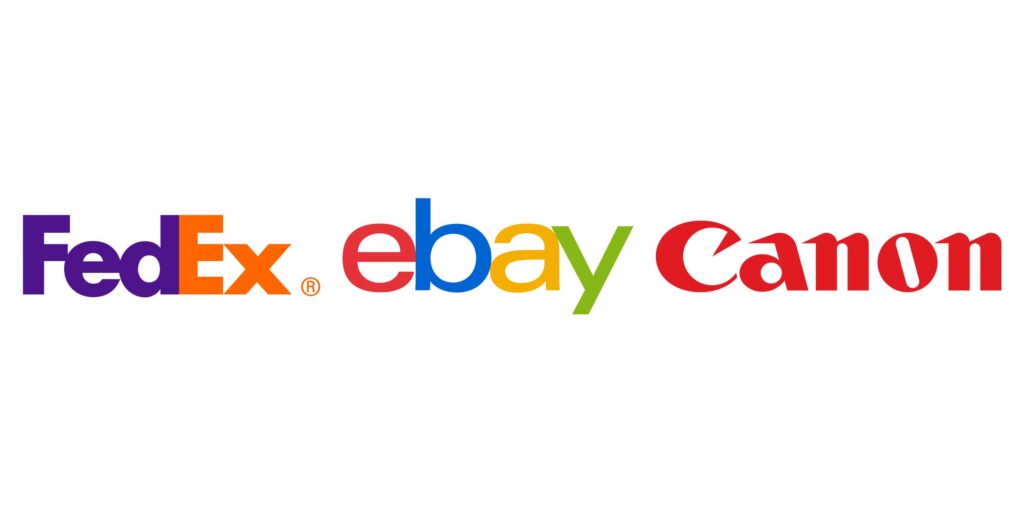
The wordmark, often known as a logotype, is the most traditional and basic type of modern logo design. It’s just the name of the firm, too. A wordmark is dependent on the corporate name. These logos—one-word, hyphenated, combination names are ideal—are typically used by businesses with short names. It is possible to stack two words in a company name.
The simplified corporate name, devoid of any symbols or images, serves as the brand’s iconic image. Coca-Cola, Google, and The New York Times are a few well-known ones. Because font trends impact wordmark logos, we’ve lately witnessed a surge in serif and display fonts.
Who Should Use Wordmark Logos?
If the following statements are true, use a wordmark logo:
- Your business has a distinct and succinct name. This makes your name stick out and become noticeable.
- Your objective is to create a powerful brand identity just from the name
- You’ll spend money on unique typefaces and hues that complement your brand.
- Simple, reproducible design objectives are set for various mediums.
- Name recognition is a key component of any marketing approach.
The Lettermark Logo
A lettermark logo is made up of one to four letters, usually the initials or first letter of the firm. Consider a monogram (or letter mark) logo or a version of a logo if your company’s name isn’t short.
When a company’s identity is represented by it, it becomes a visually striking image in place of a conventional sign. The initials naturally take center stage in the logo. Both readable and memorable elements are required in your design. Consider placing the whole company name beneath the logo if you’re a new child on the block.
Who Should Use Lettermark Logos?
Think of using a lettermark for:
- A lengthy company name that is abbreviated into easily recalled initials.
- Both conventional and professional in style. Such a style is frequently seen in government offices, financial services companies, and legal firms.
- Regarding monogram logos, new businesses should proceed with caution because this design needs a certain degree of brand awareness to be effective.
- A lettermark logo helps international businesses since it lowers linguistic barriers.
Pictorial Logos
Visual representations of the brand name or purpose comprise pictorial or symbolic logos. These can be identifiable symbols, images, or form compositions.
For instance, Dropbox features an open box, Shell features a shell, and Twitter features a bird. Finding a symbol that graphically represents your brand name or narrative is quite simple. The secret is to infuse it with an extra dash of individuality and distinctiveness.
Who Should Use Pictorial Logos?
Consider the following advice if you think a pictorial logo is a good idea but aren’t convinced it’s the best option:
- If you already have a well-known and established brand, use a logo symbol. Brand familiarity is essential to these logos.
- If your marketing plan is worldwide, think about using a picture mark. Visuals are generally comprehended.
- If the narrative behind your brand is distinct enough to be captured in a picture.
- To create a logo that is eye-catching and simple to recall, use a pictorial mark. Words aren’t always as memorable as pictures
Abstract Logo
A firm or product can be represented by an abstract logo by using symbols, typefaces, or colors without direct reference. Slack’s crisscross logo and Pepsi’s “swirl” logo are both abstract logos. These abstract logos clearly distinguish something, even if they aren’t related to anything.
They can be utilized when a firm wishes to stand out in the market while maintaining an open-ended and adaptable brand. Customers can then interpret the brand in a way that suits them.
Who Should Use Abstract Logos?
For your design, consider the following factors while selecting abstract logos:
- If you want to share feelings or morals without being limited to a certain picture, This gives your brand a distinctive representation.
- When you’re trying to create a unique, identifiable brand, These distinctive logos provide you with artistic flexibility in the marketplace.
- An effective logo for many platforms is what you seek. Simple forms that are easily recognized at tiny sizes are a common feature of abstract logos.
- Your goal is brand adaptability. Without losing their identity, abstract logos can change along with the brand.
- The brand has a long or intricate name. A straightforward, abstract sign could be easier to remember and identify.
Emblem logo
The emblem is among the first types of a logo. A vintage-style text container (usually a circle or another form) contains the parts of an emblem logo. Emblem logos are handled as a coherent visual rather than text.
The logo can convey elegance or grandeur; it is frequently connected to well-established firms. Emblem logos, due to their form, are excellent social media profile photos. Because of their distinctive patterns, they also look amazing when printed on almost anything, from apparel to stickers.
Who Should Use Emblem Logos?
Choose an emblem for your logo if you want to convey longevity or heritage. Think about this:
- If the design of your symbol and your brand name work well together, use them.
- If your company is in a conventional or formal sector, choose an emblem for your logo.
- If your logo has to convey a message, think about using an emblem. Symbolic components can frequently find room in the emblem.
- Use emblem logos with caution. It may lose features when resized, much like combo logos.
- If you have a modern branding plan, stay away from emblem logos. Misaligned emblems can appear.
- Making an emblem is expensive! It’s likely going to take a lot of work and an expert designer
Dynamic Logos
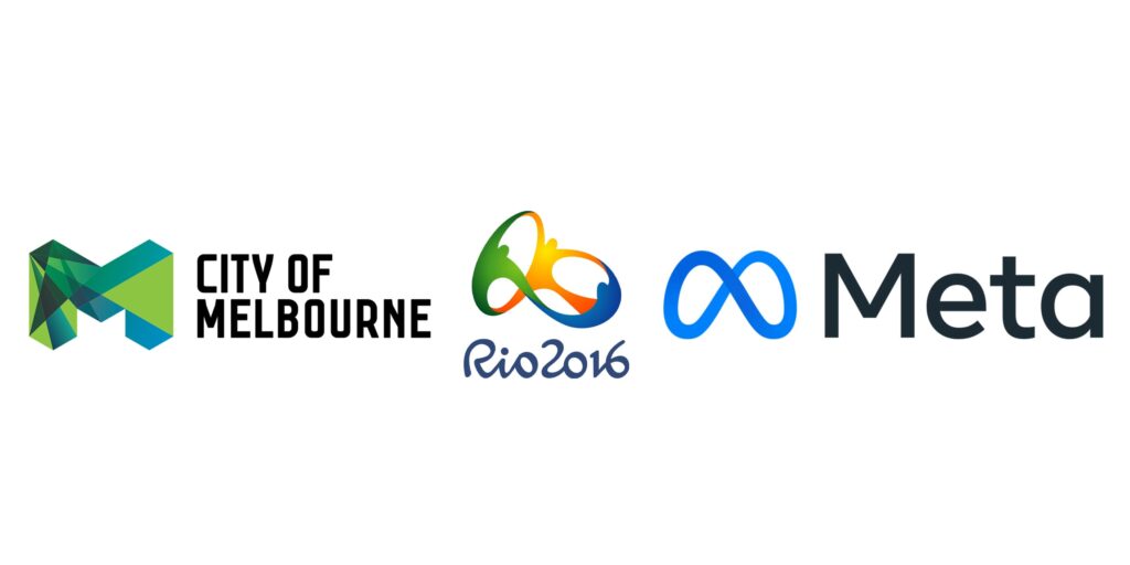
Dynamic logos flourish precisely because of their constancy. These modern logo designs need a fundamental structure that acts as the central theme that appears in every iteration of the logo.
Consider opening your Google browser and seeing the familiar wordmark logo suddenly distinguished by historical people, events, or celebrations, but you always know it’s Google. With enough power behind their brand, they may alter their instantly identifiable logo to create new looks that are contemporary and relevant while still reinforcing their established narrative.
Who Should Use Dynamic Logos?
If you want to stick with your logo for eternity, pick a dynamic one. Learn more about this:
- Your company should be well-known enough to have a dynamic logo.
- If you are a major brand that has overtaken smaller firms, attracts a wide range of people, or will be featured in many locations.
- You may begin incorporating dynamism into your logo if it has already evolved and gained recognition.
- This kind of logo can be ideal for you if you operate in the creative sector and want to remain original and inventive.
3D Logos

Three-dimensionalizing your logo will provide another level of distinctiveness. Make your logo seem metallic; make the letters in your wordmark stand out from the page; or make the design around your brand name appear true.
It takes certain design abilities to create a 3D logo. The proper placement of lighting, shade, perspective, and doubling up on forms are all necessary. For usage on touchpoints where a 3D version won’t fit, 3D logos require a flat alternative.
Who Should Use 3D Logos?
When a flat design has subtle details that trick the eye into believing it is 3D, it makes a wonderful logo.
Why is a 3D version of your logo necessary?
- Businesses that are extremely complicated and require more than just a form to convey their narrative benefit from 3D logos.
- A 3D logo will help you if you wish to successfully brand and market your company.
- To obtain a 3D logo, firms must, wherever feasible, establish areas of contrast.
- You must choose an extravagant brand color scheme for 3D logos since they cannot appear simple.
Selecting The Appropriate Logo Types
Recall that your logo will exist in both physical and digital forms. It will be resized, printed on paper, and published as a profile photo, among other things. To have both on hand, it is therefore quite typical for businesses to produce modern logo designs with and without an image.
Farah Jawed Khan
Content Writer | Digital Marketer
I have been doing content writing since 2019. I have covered a vast area of services and products like IT, Fashion, Law, Business Coaching, Automobile, and the list goes on.

